Tin Can: COmplete Design & sourcing


PACKAGING DESIGN FROM CONCEPT TO PRODUCTION
This small startup invented a new way for kids to call their friends with a re-imagined landline. They had no experience sourcing or designing custom packaging. I helped them design and source every packaging component of the unboxing experience.
The Tariff news hit right as we were about to place our order, so we had to do a late-stage redesign of the product box. By shifting from a rigid box to a folded carton (that acts like a rigid box), we were able to reduce the cost to offset the Tariffs.
DeTAILS
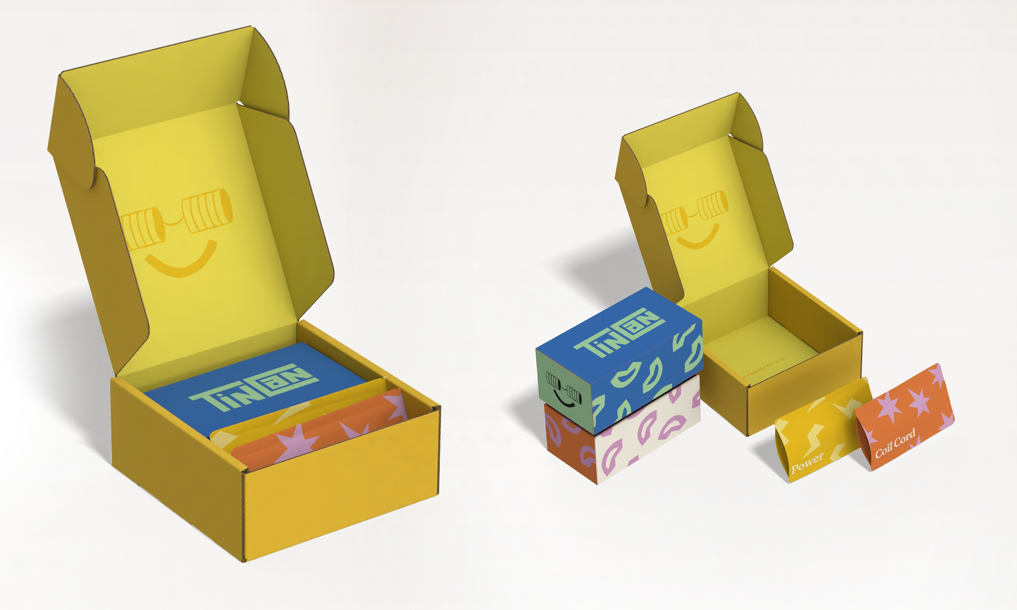
We created a lift tab device to solve for the fact that users were “dumping” the phone out of the box. The lift tab was also the perfect place for some cute messaging.
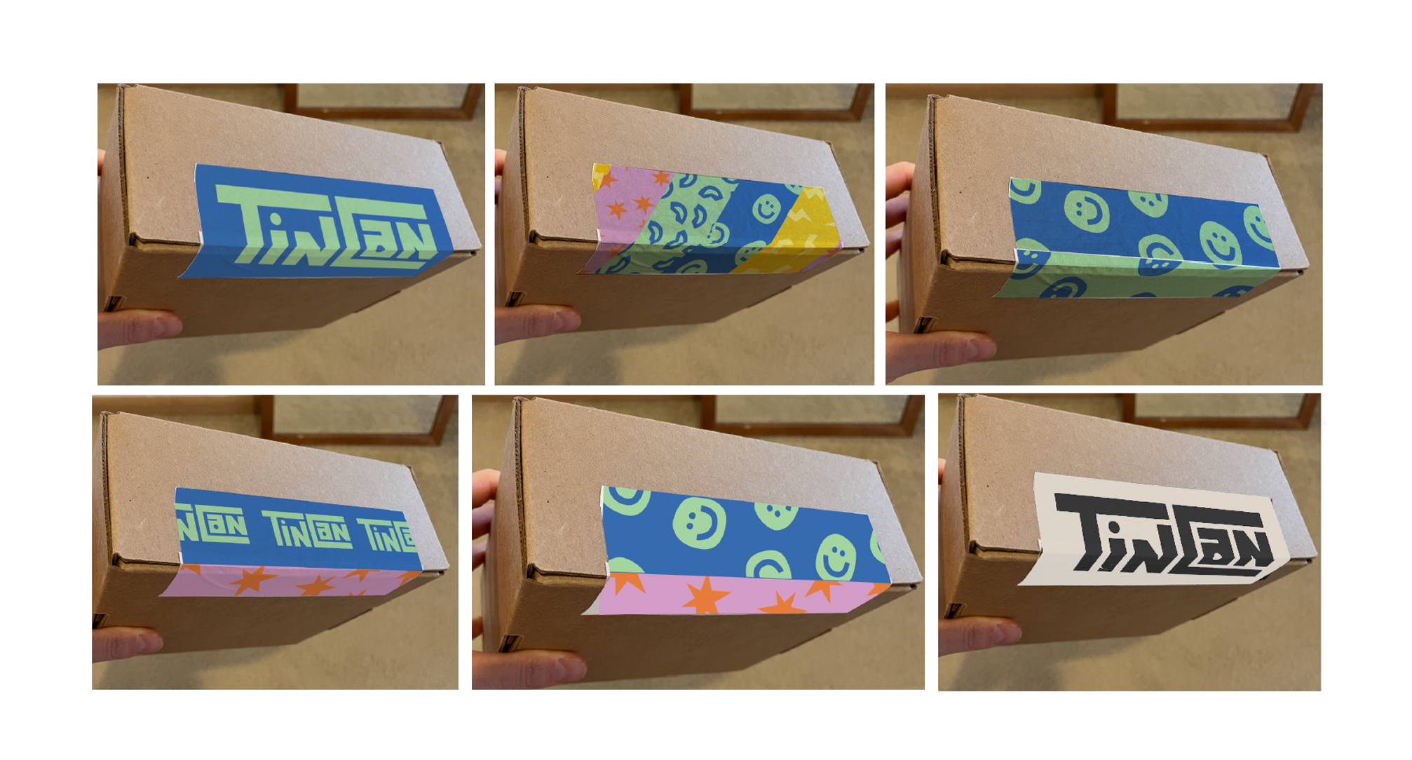
“Tinothy Tape” to close the cable bags were a preferred solution for packout, and the bags are easier to open than a glue-sealed solution.
PROCESS OVERVIEW
〰️
PROCESS OVERVIEW 〰️
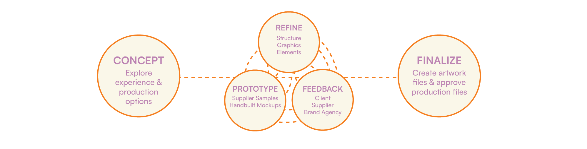
CONCEPT DEVelopment
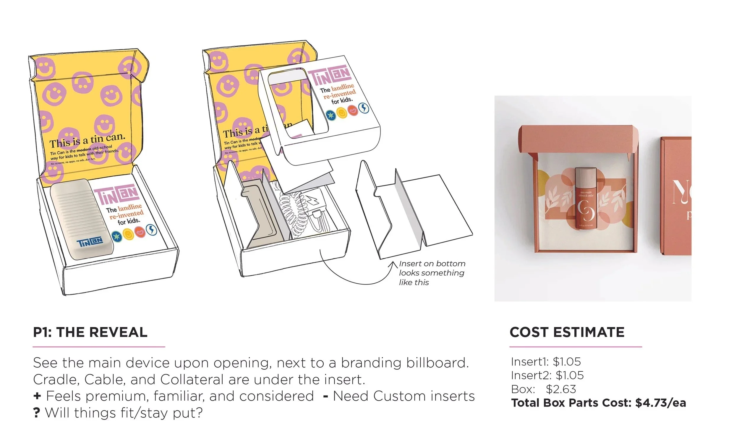
Concept 2 was the chosen direction, but we wanted to include some sort of reveal. This is how we landed on a telescoping rigid box design instead of a simple carton.
In the end, the rigid box evolved to be a telescoping folded carton. It was lighter, felt more appropriate for the product, and saved us on Tariffs.
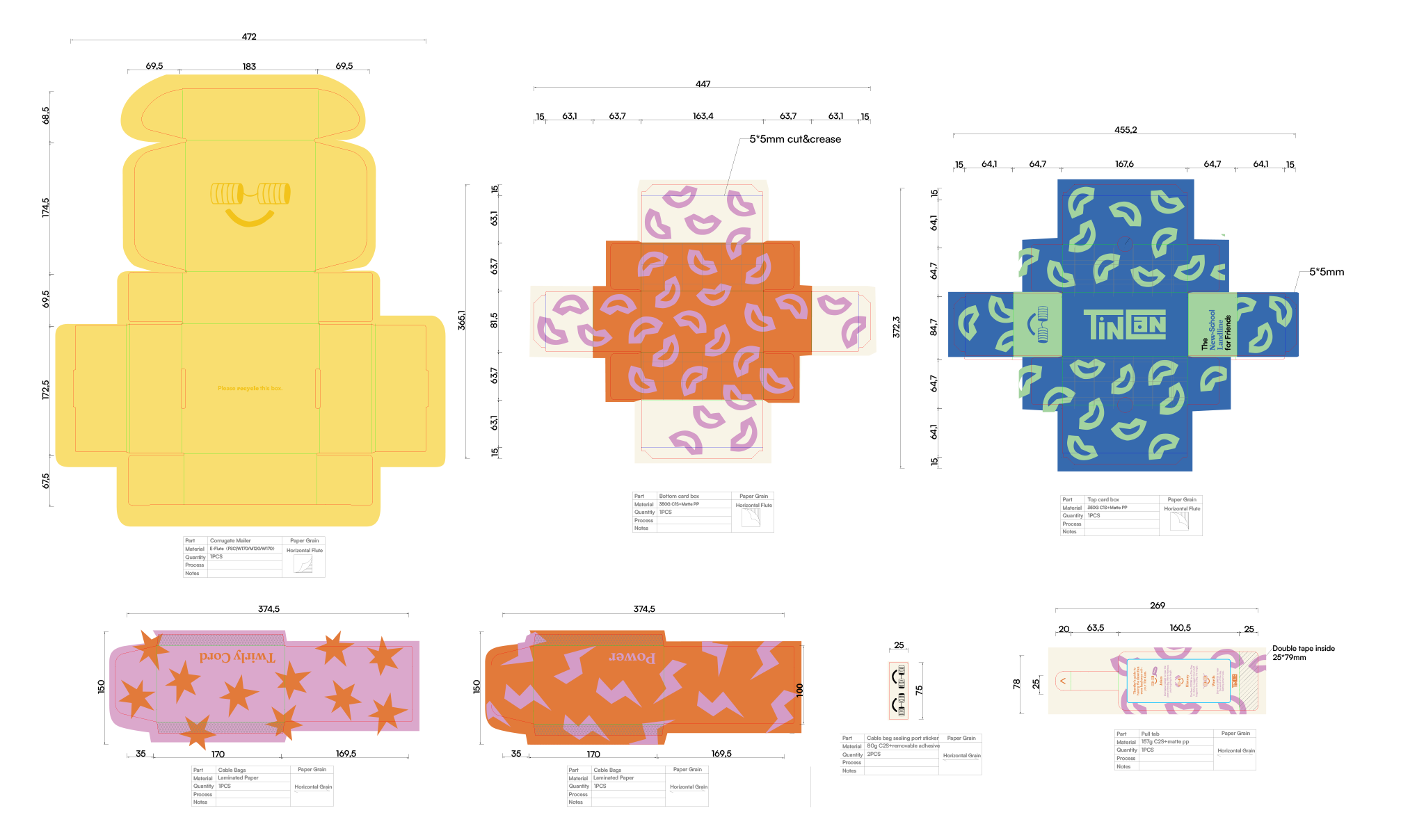
RefinE: STRUCTURE
I developed each packaging part to high fidelity and created an RFQ for supplier engagement.
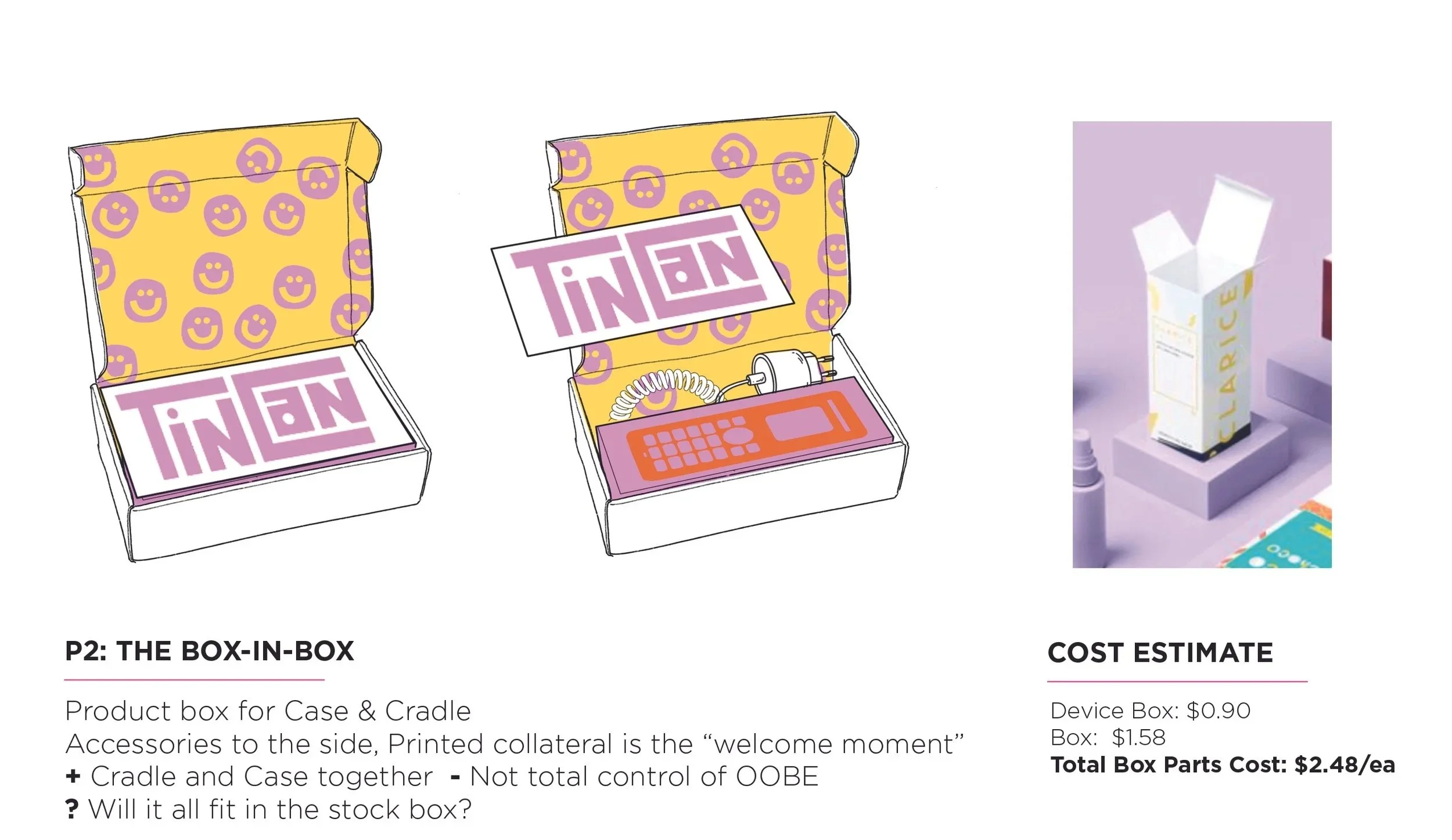
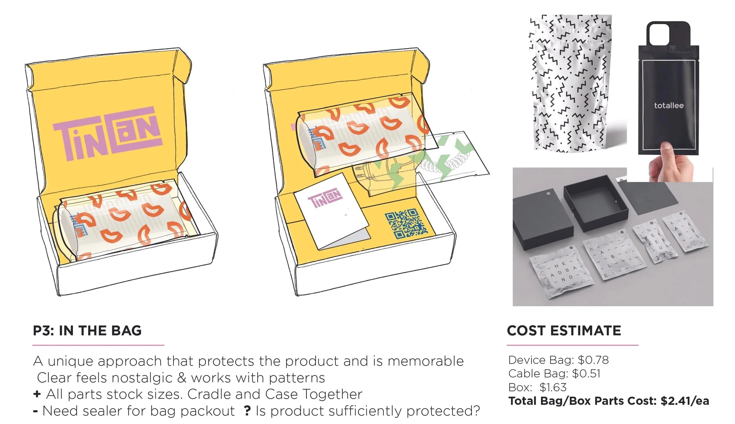
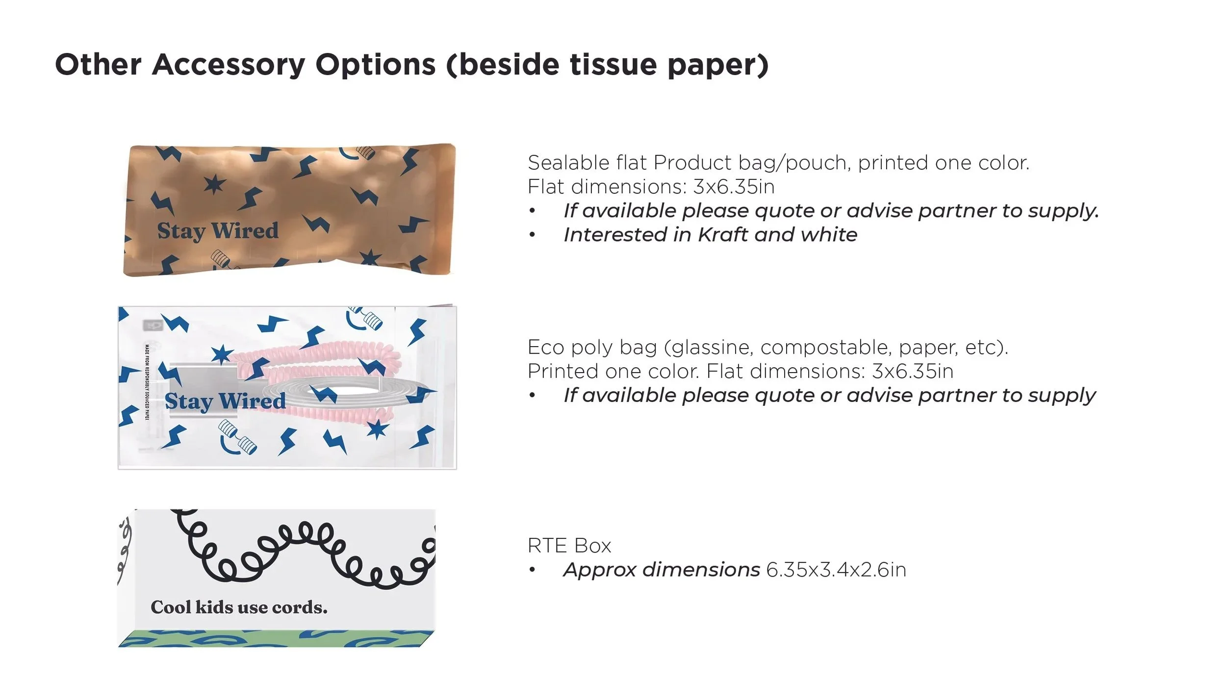
We were evaluating cost and exploring different cable container options (box, bag, tissue paper).
Product design details were still being finalized, so I had to stay agile while the final cable specifications and product weight/size were established.

PROTOTYPE
Ordering samples, printing my own, building new solutions with suppliers. This was a big part of our development process for this project.
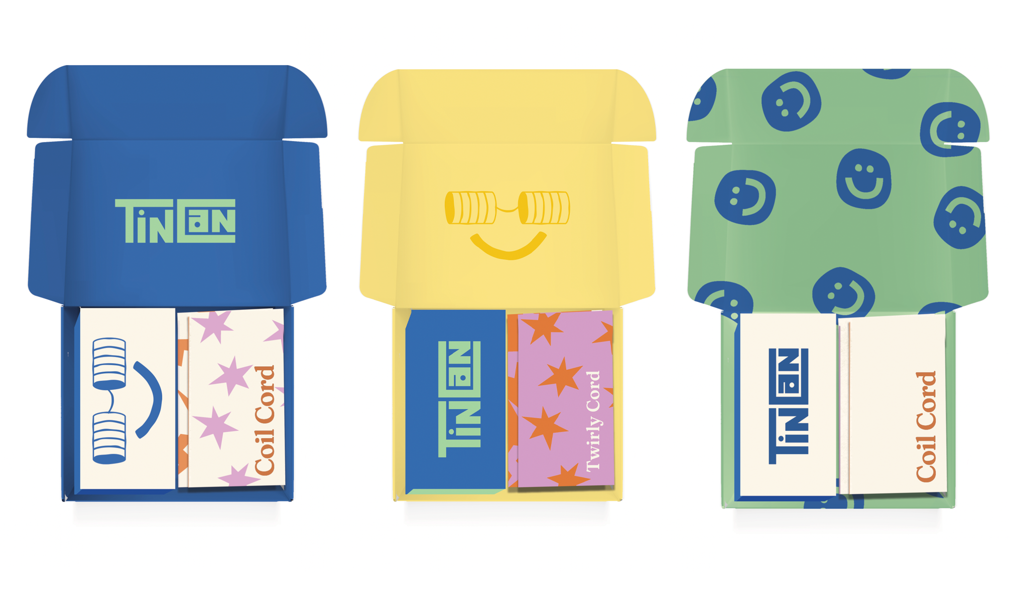

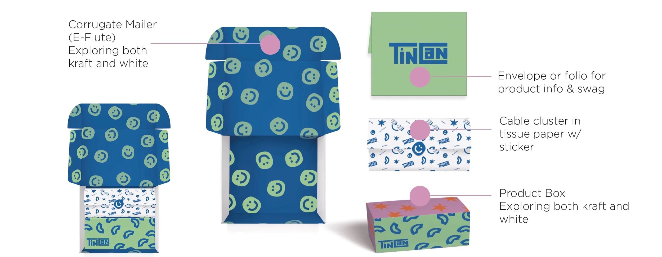
REFINE: Graphics
The colorful brand palette, and lack of rigid guidelines gave me a wide playing field for graphic development in the overall experience.
The structure required a “lift tab” for easy product access. This was a fun graphic exercise in flexing the brand personality through slight modifications to the “Tinothy” character.
Closure tape is the first moment in an unboxing experience with the consumer, so it’s important to portray the brand ethos. I advocated for a design that had a sneaky application feature - a color break- that would make it easier for packers to align the tape perfectly every time.
FINALIZE: Final design leans into the bright colors of the brand.
I worked with the supplier to finalize the design details, approved final white samples, and created final artwork for production.
I also provided a packet video for the warehouse.