
SURFACE EARBUDS: STRUCTURAL PACKAGING & OOBE GRAPHICS


Balancing Design language with user experience
The OOBE was designed with a focus on the initial startup process and gesture communication, as well as product reveal. I explored a wide range of options with different experiential strategies. The top concepts were tested with users in partnership with internal research teams, and the final product aligns our Surface Packaging Language with user needs.
THE IMPORTANCE OF PROTOTYPING
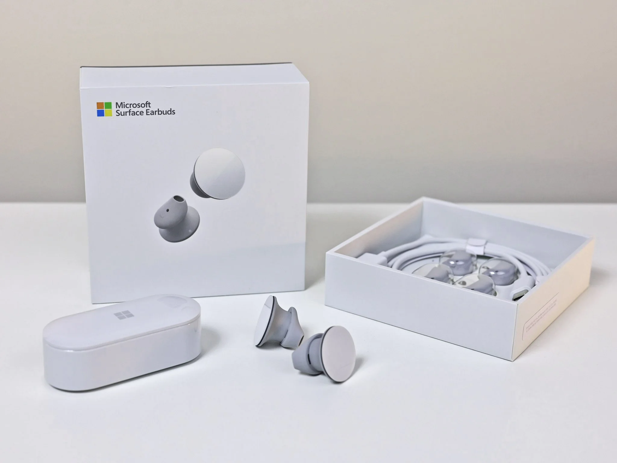
This particular product had some novel features and a relatively complex setup experience, relying solely on audio and an app. It was important that the unboxing experience set users up for success.
I moved very quickly from rough sketches to renderings and into physical prototypes. Testing the physical experience was an important component to the process - it helped highlight pain points and user realities so we could ensure a successful first moment.
See more hand-built prototype examples below.
PROCESS OVERVIEW
〰️
PROCESS OVERVIEW 〰️

Mapping Moments
I worked with research and ID teams to develop a process for packaging design. Centered in collaboration, it starts and ends with team alignment and has a healthy prototype & test cycle in between.
Scaling research methods
Our varied approach to research helped us isolate and solve key pain points in the context of the overall, end-to-end experience. This allowed us to get more insights througout the design journey.


ROUGH OOBE DEVelopment
Exploring early high-level concepts meant focusing on sequence and overall form.
These quick renderings acted as OOBE vignettes, showcasing potential sequences and box sizes across several concepts.
RefinE: STRUCTURE
I developed each packaging part to high fidelity and created an RFQ for supplier engagement.
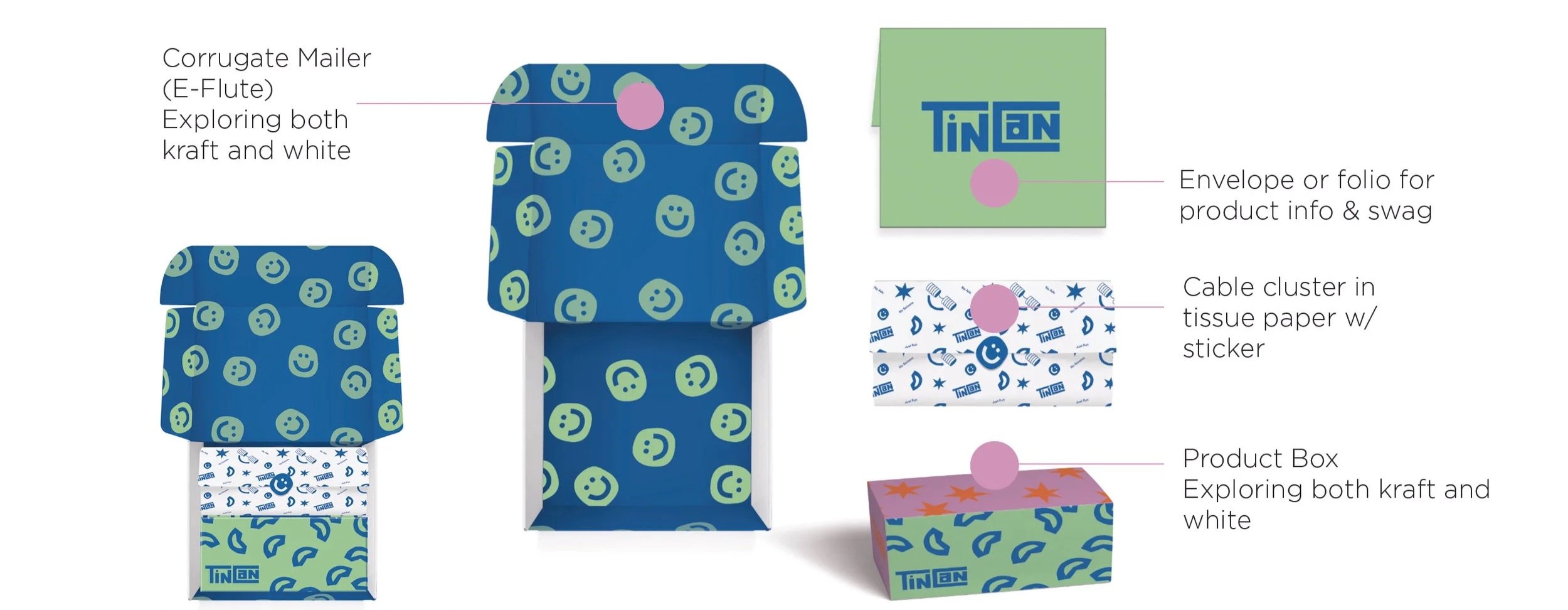
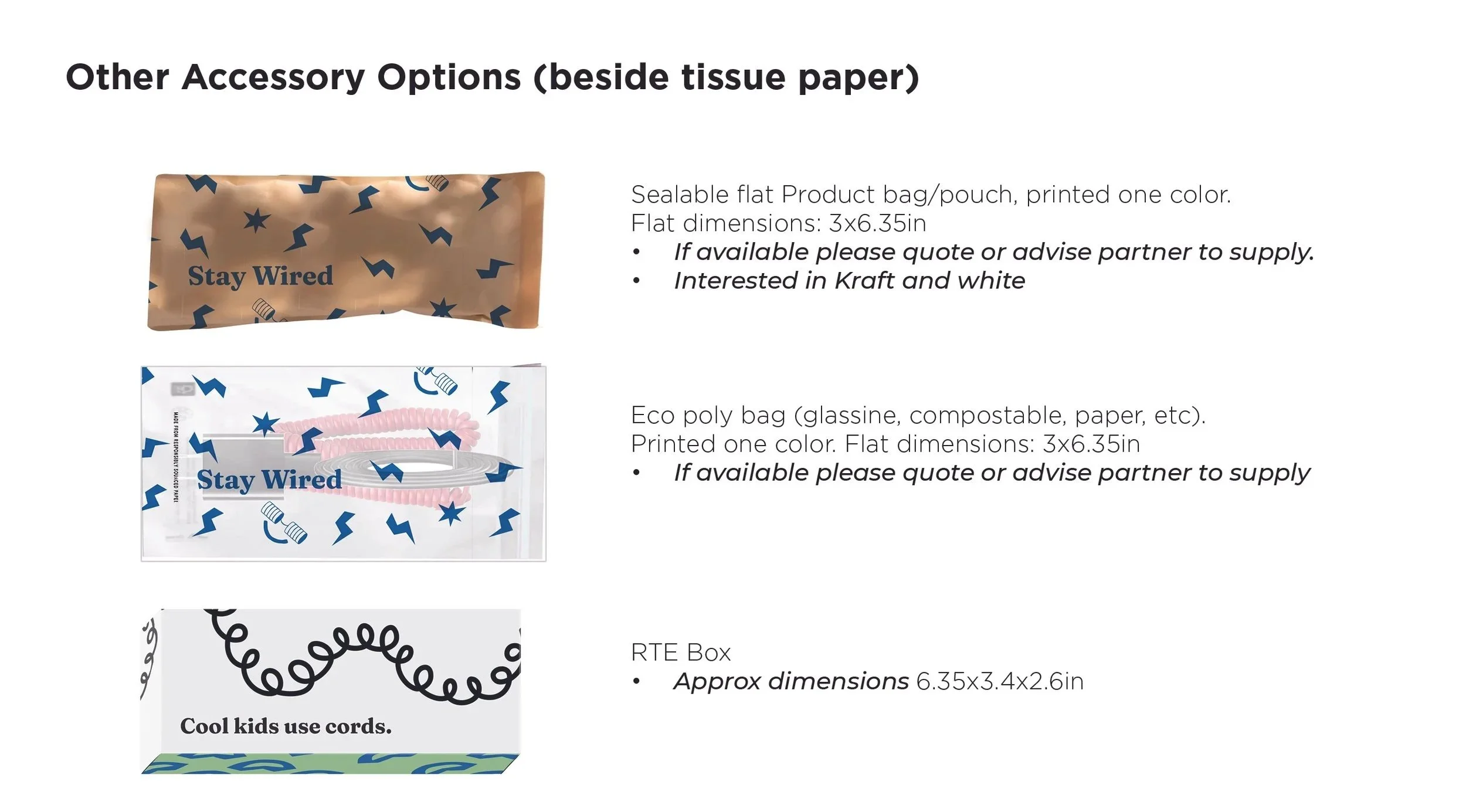
We were evaluating cost and exploring different cable container options (box, bag, tissue paper).
Product design details were still being finalized, so I had to stay agile while the final cable specifications and product weight/size were established.

PROTOTYPE
Ordering samples, printing my own, building new solutions with suppliers. This was a big part of our development process for this project.

REFINE: Graphics
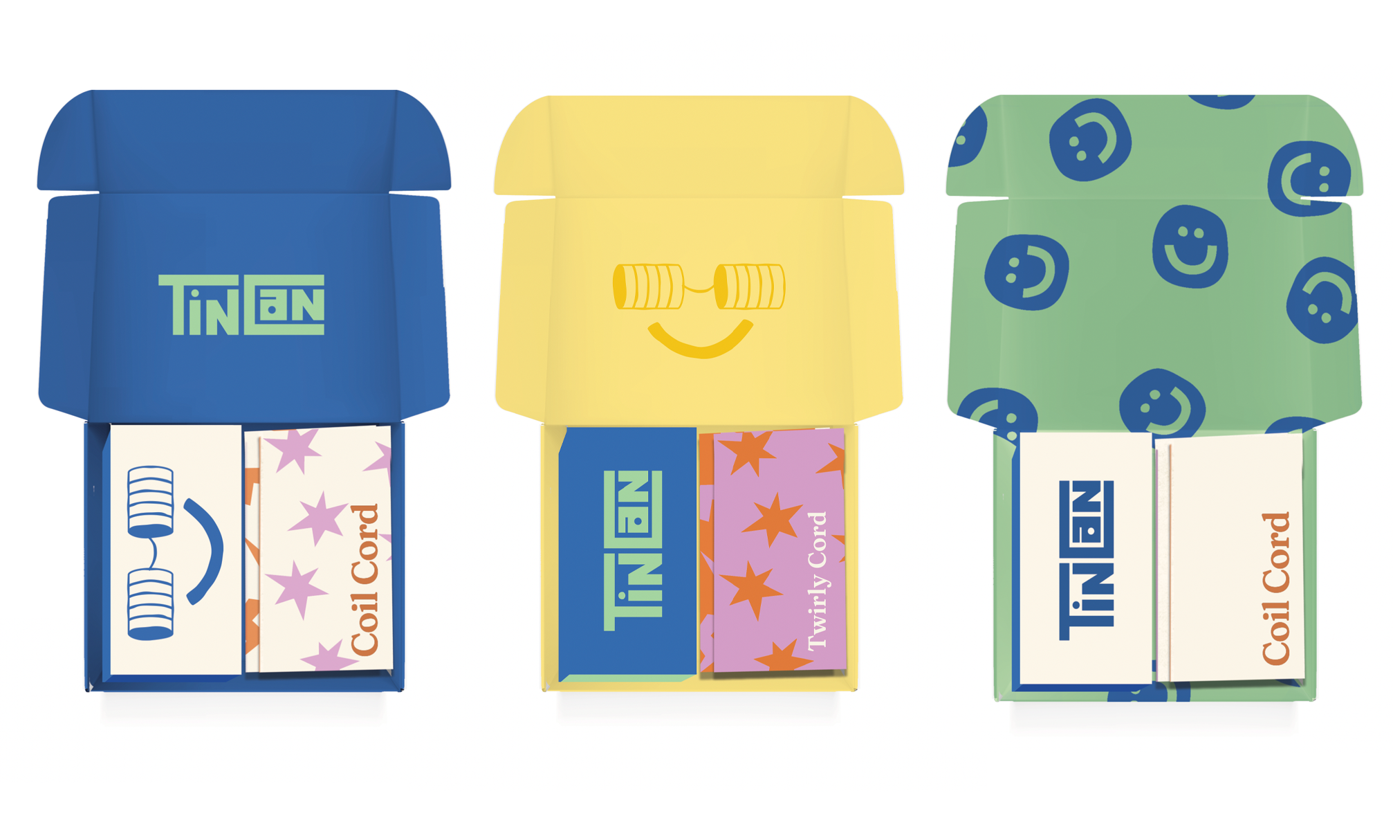
The colorful brand palette, and lack of rigid guidelines gave me a wide playing field for graphic development in the overall experience.
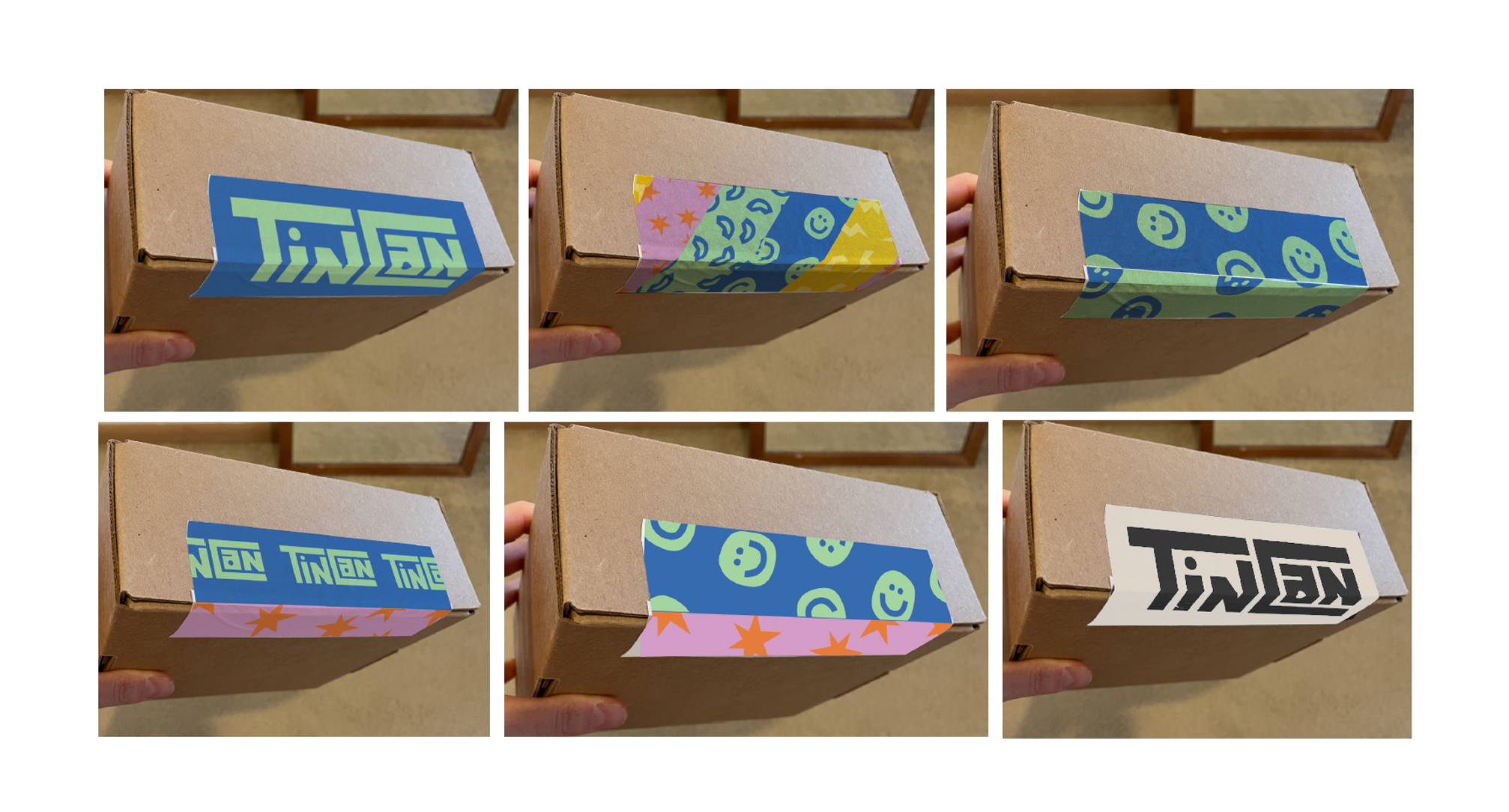
The structure required a “lift tab” for easy product access. This was a fun graphic exercise in flexing the brand personality through slight modifications to the “Tinothy” character.
Closure tape is the first moment in an unboxing experience with the consumer, so it’s important to portray the brand ethos. I advocated for a design that had a sneaky application feature - a color break- that would make it easier for packers to align the tape perfectly every time.